In this article, I will show you the highest performing Google AdSense banner sizes and placements for best of both – better earnings and good user experience.
XenForo 2 has multiple ad locations where you can place the ads. Here is a Visual Guide To Ads in XenForo 2
Why Some Google AdSense Banner Sizes Work Better?
Google AdSense majorly pays for clicks but also adds banner impression to maximum the inventory for publishers. To maximize the revenue, one has to select a banner size that has maximum advertisers competition.
The next aspect to maximize revenue is to increase the click-through rate or CTR for ads. Ads that are closer to the content or are easily visible upfront get a higher CTR and can generate higher revenue.
Top Performing Google AdSense Banners
AdSense run their own tests to see how ads are performing on various kind of websites and share their recommendations. I have done my own tests of Google AdSense over the years on my forums as well as for many of my clients.
Based on my understanding of Adsense reports and my experiment, below are the top performing Google AdSense banner sizes in the XenForo 2 layout.
In the Header: Leaderboard (728×90) / Mobile Leaderboard (320×50)

Leaderboard (728×90) is a common banner size for advertisers. In the header, on the right, a leaderboard banner works in forums. If the eCPM of this banner isn’t as much as expected, switch to social media icons or use an internal banner.
Another important point to consider when you want to add a banner in the header is the height of your logo. If the logo isn’t very tall, a banner in the header can look slightly off or you may need to lower the size of the banner. Reduced size banner often doesn’t work well in the header.
Below BreadCrumb: The Billboard (970×250) / Large Leaderboard (970×90) / Large Mobile Banner (320×100)

If header banner isn’t working for you, try a billboard (970×250) under the breadcrumb.
The billboard can be a bit too much for members but if you don’t have any other ads in the header, it may be still ok to have a billboard or you can display the billboard only to guests and reduce the size for members.
If you have an ad in the header or in the thread title, opt for large leaderboard instead of a billboard.
Top of Sidebar: Medium Rectangle (300×250)

Medium Rectangle (300×250) ad format has the maximum number of advertisers. It can have both text and banner ads and works fine even on every device.
Often it is best suited in the sidebar of every website but in the XenForo with the default theme, you may need to change the width of the sidebar from 250px wide which kinda default to 300px.
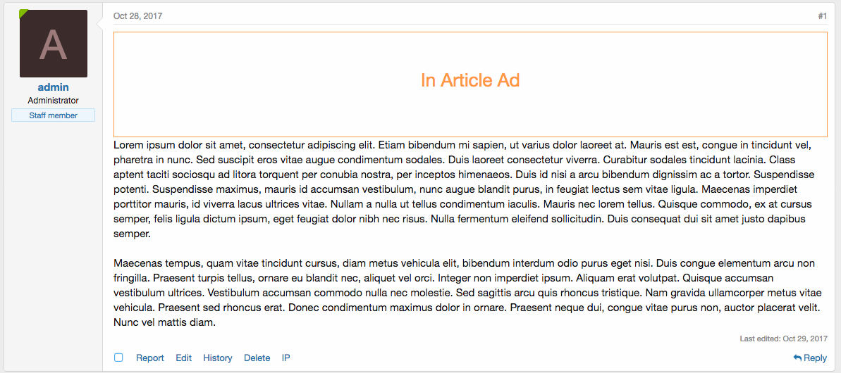
Within Content: In Article Ad / Medium Rectangle (300×250)

Thread pages have maximum traffic in a forum. So any ad that is within the thread content is bound to generate lot more ad impression as well as clicks.
The best option is to have an in article ad unit or a medium rectangle (300×250) within the content.
The in-article ad unit is responsive to fit both text and banner ads and has much better CTR similar to the medium rectangle (300×250). Both work best.
Also Read: How to Show Ads Only In The First Post Of XenForo 2.
After Thread Title: Leaderboard (728×90) / Mobile Leaderboard (320×50) / Responsive Ad Unit

The other best unit for thread pages is an ad just below the thread title. It can generate a lot of clicks and yet isn’t at all annoying to the user.
If you have a billboard after the breadcrumb as well as an ad below the thread title, it can be a bit too much for the user experience. So either opt for a smaller ad unit instead of a billboard or opt for only after thread title ad. Run an experiment to check what works the best for your forum and for your members.
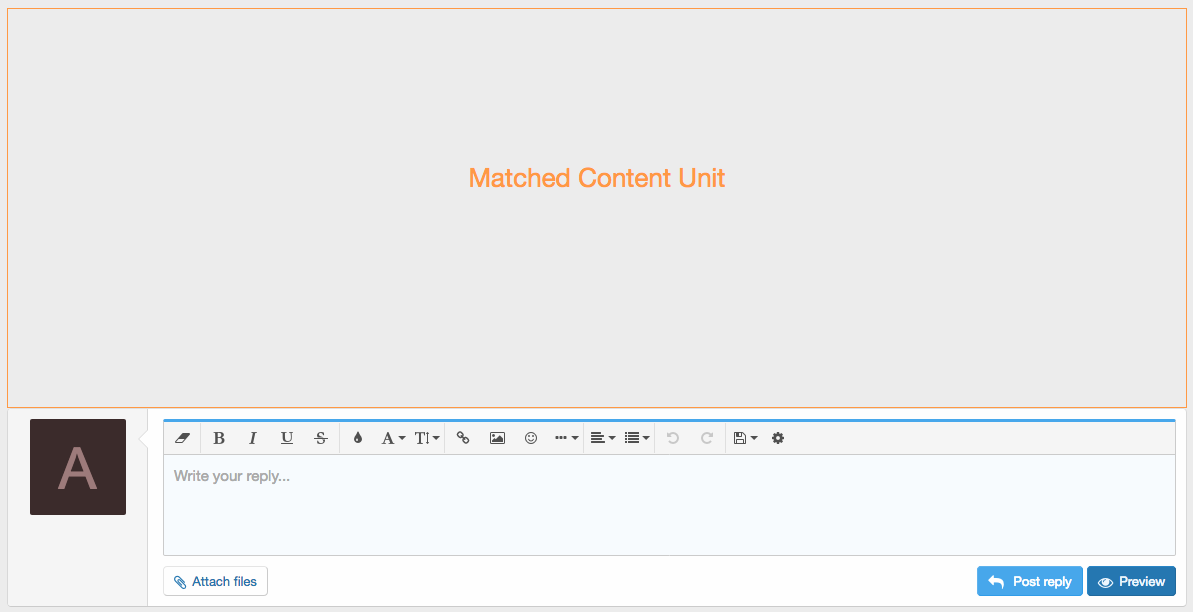
After Content: Matched Content Unit

After posts and just before the quick reply box, a matched content unit will help drive a lot of users to related threads and increase the site’s overall page views and have ads integrated between those internal links to drive revenue.
The matched content unit works best if you have images in the content. If there aren’t any images or if you have attachment invisible to guests, the layout of the matched content unit may not work very well. If you don’t have images based content, add the open graph image tags to the high traffic thread pages.
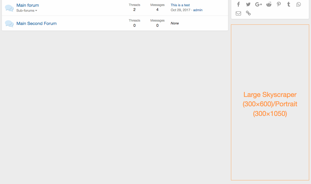
End of Sidebar: Large Skyscraper (300×600)/Portrait (300×1050)

The large skyscraper as the last element in the sidebar may not generate too many clicks but because of its size, advertisers prefer it. It gives more exposure to bigger brands and so it has better-paying ads to generate a good incremental revenue for impressions.